


 How to resolve AdBlock issue?
 - Posts: 49
- Thank you received: 40
×
Bugs: Recent Topics Paging, Uploading Images & Preview (11 Dec 2020)
Recent Topics paging, uploading images and preview bugs require a patch which has not yet been released.
×
Talk about whatever you like related to games that doesn't fit anywhere else.
Will Fantasy Flight ever hire a real graphic designer?
Less
More
29 Nov 2015 03:36 - 29 Nov 2015 03:45 #216093
by dontbecruel
Fair points doc, but the line between the practical communication techniques and the "art" stuff is not necessarily clearcut.
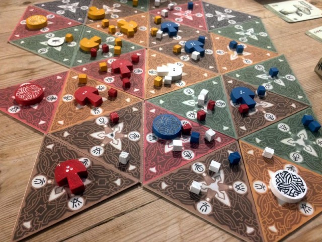
Phil Eklund's attic-hoarder-outsider-artist collage style makes me want to find out what the hell story he is trying to tell. It draws me into his personal world. Whereas the generic-illustration-plus-professional-industrial-design sci-fi-by-numbers stuff above makes my brain fog over so there is no chance it will ever reveal its secrets to me.
Replied by dontbecruel on topic Will Fantasy Flight ever hire a real graphic designer?
Dr. Mabuse wrote:


Fair points doc, but the line between the practical communication techniques and the "art" stuff is not necessarily clearcut.
Phil Eklund's attic-hoarder-outsider-artist collage style makes me want to find out what the hell story he is trying to tell. It draws me into his personal world. Whereas the generic-illustration-plus-professional-industrial-design sci-fi-by-numbers stuff above makes my brain fog over so there is no chance it will ever reveal its secrets to me.
Last edit: 29 Nov 2015 03:45 by dontbecruel.
The following user(s) said Thank You: Frohike
Please Log in or Create an account to join the conversation.
29 Nov 2015 10:02 - 29 Nov 2015 10:03 #216096
by Sevej
Replied by Sevej on topic Will Fantasy Flight ever hire a real graphic designer?
Ah, I was probably too busy finding what's what in Pax Porfiriana last time I played to discover any hidden stories... What I remember... it seems to have pink army?
Last edit: 29 Nov 2015 10:03 by Sevej.
Please Log in or Create an account to join the conversation.
- Dr. Mabuse
-

- Offline
- Ambassador of Truth
-

29 Nov 2015 12:00 - 29 Nov 2015 12:02 #216098
by Dr. Mabuse
With the complexity level of Pax this especially holds true. For every one person who wants to get lost in Ekland's personal world, there are at two that want to get on with it and learn the fucking game but can't parse the relevant information from the "art". Using minor tweaks to the layout would probably shave at least 5 minutes from its teaching time.
Not sure if you're trolling or not but how difficult is it to understand your health is 10 Endurance is 5 Speed 4 Defense ((as I stated in my last post) is rolling a white die. The specifics can be filled in, literally, as the game is played.
For most players the bulk of the experience will lie in actually playing the game and not poring over the card.
Replied by Dr. Mabuse on topic Will Fantasy Flight ever hire a real graphic designer?
Design isn't a perfect science but ultimately you have to design for the masses, that's it's role. You can still have "arty" stuff and use design techniques to make your point clearer.dontbecruel wrote:
Dr. Mabuse wrote:
Fair points doc, but the line between the practical communication techniques and the "art" stuff is not necessarily clearcut.
Phil Eklund's attic-hoarder-outsider-artist collage style makes me want to find out what the hell story he is trying to tell. It draws me into his personal world. Whereas the generic-illustration-plus-professional-industrial-design sci-fi-by-numbers stuff above makes my brain fog over so there is no chance it will ever reveal its secrets to me.
With the complexity level of Pax this especially holds true. For every one person who wants to get lost in Ekland's personal world, there are at two that want to get on with it and learn the fucking game but can't parse the relevant information from the "art". Using minor tweaks to the layout would probably shave at least 5 minutes from its teaching time.
Not sure if you're trolling or not but how difficult is it to understand your health is 10 Endurance is 5 Speed 4 Defense ((as I stated in my last post) is rolling a white die. The specifics can be filled in, literally, as the game is played.
For most players the bulk of the experience will lie in actually playing the game and not poring over the card.
Last edit: 29 Nov 2015 12:02 by Dr. Mabuse.
The following user(s) said Thank You: Cranberries
Please Log in or Create an account to join the conversation.
Less
More
- Posts: 231
- Thank you received: 125
29 Nov 2015 14:51 - 29 Nov 2015 14:55 #216108
by SuperFlySwatter
Replied by SuperFlySwatter on topic Will Fantasy Flight ever hire a real graphic designer?
Its probably my loss but I have the same feeling about Eklund - I feel like hes trolling at this point with his design and also shite rulebooks. Plus every game of his I've actually taken the time to play has been shit (OK, thats mainly Greenland, which was truly shit). I never found the time to get High Frontier to the table but I backed the new version and am looking forward to it. (though it also irks me all the shit he spouts on his website about how its OMG such an intelligent game for only the smartest of people. Including loads of subject specific technical terms and info doesnt translate to smart game, doesnt there come points in the game that can basically decide the entire outcome based on the roll of a d6?. Well, it looks fun anyway but my eyes glaze over with all that OMG SO SMART crap)
Pax seems like it has a lot going for it but
a) I dont give a fuck for the mexican theme, in fact, I'm negatively interested
b) for fucks sake the rulebook and just glancing at the cards
c) a combo of the above plus, why would I not just play Innovation or Race?
I know I'm probably missing out on a good game, but I'm too tired, old and grumpy to care. I expect the reality of the gameplay is pretty straightforward once you get past his trolling.
(PS, I am stlll glad Eklund exists and does his thing though, boardgaming needs more individuals, and in that regard, I can dig Mabuses vibe about the mental art at least providing a bit of soul to draw you into what the hell is he thinking. But damn, fuck those rule books)
Last edit: 29 Nov 2015 14:55 by SuperFlySwatter.
Please Log in or Create an account to join the conversation.
- Cranberries
-
 Topic Author
- Offline
- D10
-

- Don't give up.
Less
More
- Posts: 3078
- Thank you received: 2364
29 Nov 2015 19:21 - 30 Nov 2015 07:14 #216119
by Cranberries
Replied by Cranberries on topic Will Fantasy Flight ever hire a real graphic designer?
I think Eklund is also a climate change denier, but I'm not sure.
I guess I'd rather see more interesting-looking art in boardgames, as opposed to some dark fantasy thing that looks like it was made with colored pencils.
Often that dark, cliched "fantasy" art plays a role in the playing of the game, so the illustration/graphic designer distinction can get a little muddled at times.
Last edit: 30 Nov 2015 07:14 by Cranberries.
The following user(s) said Thank You: Frohike
Please Log in or Create an account to join the conversation.
- Disgustipater
-

- Offline
- D8
-

- Dapper Deep One
Less
More
- Posts: 2181
- Thank you received: 1685
29 Nov 2015 21:27 #216127
by Disgustipater
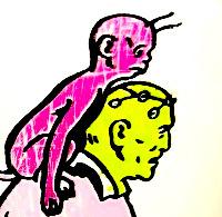
It took me a while to realize that this was a card from an actual game. It looks...appalling.
Replied by Disgustipater on topic Will Fantasy Flight ever hire a real graphic designer?
dontbecruel wrote:
It took me a while to realize that this was a card from an actual game. It looks...appalling.
Please Log in or Create an account to join the conversation.
29 Nov 2015 21:34 #216128
by wadenels
It is appalling, when held out singularly like that.
Even in the context of the game in play it isn't great. However those cards from Pax Porfiriana really look the part during a game. They're almost endearing once you've been through a couple games. It's a curious thing.
Replied by wadenels on topic Will Fantasy Flight ever hire a real graphic designer?
Disgustipater wrote:
dontbecruel wrote:
It took me a while to realize that this was a card from an actual game. It looks...appalling.
It is appalling, when held out singularly like that.
Even in the context of the game in play it isn't great. However those cards from Pax Porfiriana really look the part during a game. They're almost endearing once you've been through a couple games. It's a curious thing.
The following user(s) said Thank You: stoic
Please Log in or Create an account to join the conversation.
29 Nov 2015 22:09 #216129
by Shellhead

Replied by Shellhead on topic Will Fantasy Flight ever hire a real graphic designer?
Disgustipater wrote:
dontbecruel wrote:
It took me a while to realize that this was a card from an actual game. It looks...appalling.
Please Log in or Create an account to join the conversation.
30 Nov 2015 07:26 #216137
by Sevej
I have to admit this true. Maybe there weren't many graphic designers back then in Mexico.
Replied by Sevej on topic Will Fantasy Flight ever hire a real graphic designer?
wadenels wrote:
Disgustipater wrote:
dontbecruel wrote:
It took me a while to realize that this was a card from an actual game. It looks...appalling.
It is appalling, when held out singularly like that.
Even in the context of the game in play it isn't great. However those cards from Pax Porfiriana really look the part during a game. They're almost endearing once you've been through a couple games. It's a curious thing.
I have to admit this true. Maybe there weren't many graphic designers back then in Mexico.
Please Log in or Create an account to join the conversation.
- metalface13
-

- Offline
- D10
-
Less
More
- Posts: 4753
- Thank you received: 701
30 Nov 2015 15:11 #216190
by metalface13
Replied by metalface13 on topic Will Fantasy Flight ever hire a real graphic designer?
If you're interested in learning more about what graphic design is and does I recommend Go: A Kidd's Guide to Graphic Design by Chip Kidd. He's a designer who mainly specializes in book covers, and you've probably seen a lot of them.
www.amazon.com/Go-Kidds-Guide-Graphic-Design/dp/076117219X
The following user(s) said Thank You: Dr. Mabuse, Cranberries
Please Log in or Create an account to join the conversation.
- metalface13
-
- Offline
- D10
-
Less
More
- Posts: 4753
- Thank you received: 701
30 Nov 2015 15:20 #216194
by metalface13
I'm not an expert at "Art" but the main differences are in tone and style. The illustrations from Imperial Assault and Android aim for more realism. Yes it's a fantasy/scifi setting but the anatomy, angles, light, etc are all fairly accurate. Mark Millar's artwork exaggerates the masculinity of the characters' anatomy. Also the positioning of the characters feels a little iffy but it's conveying a lot of energy, you can almost feel that kick to the chin with Batman's massive boot. While there is gradation in the colors, it feels a lot more flat than the other examples. The Tokaido art is stylized in a different direction. The characters are stylized in a more "cartoony" many, big head, thing neck, thinner arms and legs. The color palate is also softer and brighter. The crisp edges in the illustration give it a "vector" look, as many designers or illustrators might call it. This means the artwork was probably completed in Adobe Illustrator which allows for crisp shapes and definitions in color whereas the Imperial Assault art looks more like a "digital painting" done in Adobe Photoshop.
Replied by metalface13 on topic Will Fantasy Flight ever hire a real graphic designer?
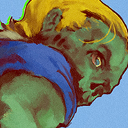
craniac wrote: Ok, first of all, FFG art is perfectly fine, and better than most. My opinions are very subjective, and not universally held. So here is some art from Android:

Now let's look at a frame from Frank Miller's The Dark Knight Returns, drawn by Frank Miller and Klaus Janson. I am not a comics guy--I had to look this up.

Here is an image from the game Tokaido:

Now here is the cover for Imperial Assault, which is perfectly fine:

Somebody more articulate than myself will have to explain the difference between these images.
I'm not an expert at "Art" but the main differences are in tone and style. The illustrations from Imperial Assault and Android aim for more realism. Yes it's a fantasy/scifi setting but the anatomy, angles, light, etc are all fairly accurate. Mark Millar's artwork exaggerates the masculinity of the characters' anatomy. Also the positioning of the characters feels a little iffy but it's conveying a lot of energy, you can almost feel that kick to the chin with Batman's massive boot. While there is gradation in the colors, it feels a lot more flat than the other examples. The Tokaido art is stylized in a different direction. The characters are stylized in a more "cartoony" many, big head, thing neck, thinner arms and legs. The color palate is also softer and brighter. The crisp edges in the illustration give it a "vector" look, as many designers or illustrators might call it. This means the artwork was probably completed in Adobe Illustrator which allows for crisp shapes and definitions in color whereas the Imperial Assault art looks more like a "digital painting" done in Adobe Photoshop.
Please Log in or Create an account to join the conversation.
30 Nov 2015 16:19 #216201
by stoic
Replied by stoic on topic Will Fantasy Flight ever hire a real graphic designer?
I have no taste. This is my favorite game art of all time:

The following user(s) said Thank You: Cranberries, Egg Shen
Please Log in or Create an account to join the conversation.
- Cranberries
-
Topic Author
- Offline
- D10
-
- Don't give up.
Less
More
- Posts: 3078
- Thank you received: 2364
03 Feb 2016 23:07 - 03 Feb 2016 23:31 #221634
by Cranberries

Mr. Cabbagehead's Garden Game
Replied by Cranberries on topic Will Fantasy Flight ever hire a real graphic designer?
Mr. Cabbagehead's Garden Game
Last edit: 03 Feb 2016 23:31 by Cranberries.
Please Log in or Create an account to join the conversation.
- hotseatgames
-
- Offline
- D12
-

Less
More
- Posts: 7176
- Thank you received: 6293
04 Feb 2016 07:59 #221642
by hotseatgames
Replied by hotseatgames on topic Will Fantasy Flight ever hire a real graphic designer?
I'm pretty sure Lord Carrotbody will be starring in an upcoming nightmare.
The following user(s) said Thank You: Cranberries
Please Log in or Create an account to join the conversation.
Less
More
- Posts: 868
- Thank you received: 301
04 Feb 2016 21:35 #221745
by Stonecutter
Replied by Stonecutter on topic Will Fantasy Flight ever hire a real graphic designer?
Holy shit the Glassdoor comments about Petersen though... I know there are bad CEOs everywhere but that's some of the most one sided commentary I've ever seen.
Please Log in or Create an account to join the conversation.
Moderators: Gary Sax
Time to create page: 0.222 seconds